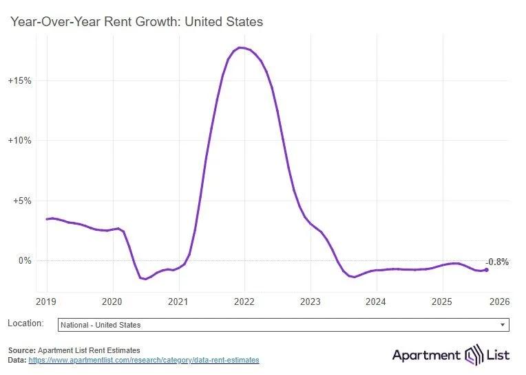

Everyone’s sharing the same rent-growth charts, but the surface-level story is misleading
.Yes, national rents look flat. Apartment List shows we’ve hovered around 0% for nearly two years. But if all you look at is the graph, you miss the real signal.
This isn’t a “cooling period.”
It’s a structural shift.
The chart won’t tell you why rents hit a ceiling:
• Affordability maxed out
• Certain metros flooded the market with supply
• Household formation slowed
• Operators pushed rents past what made sense
The line shows the outcome.
The insight is in the mechanics.
And when you dig deeper, the picture changes: investors who relied on automatic rent bumps are getting squeezed, while operators focused on retention, renewals, expenses, and real value creation are outperforming.
One more thing the chart hides:
National averages blur out local truth. Sunbelt oversupply drags everything down, while better markets don’t follow that line at all.
Bottom line: don’t take graphs at face value.
Understanding what drives the numbers, and which levers you can still pull, is where the real returns are.